Use Flex
Flex styles are a way of changing the layout of the page so it is responsive. When using Flex, the layout and position of the Blocks will respond to fit the screen, which is important in ensuring that users have a good user experience regardless of the screen size they are viewing your Application on.
Note
It is recommended that you read the article listed below to improve your understanding of Devices and the Style Manager.
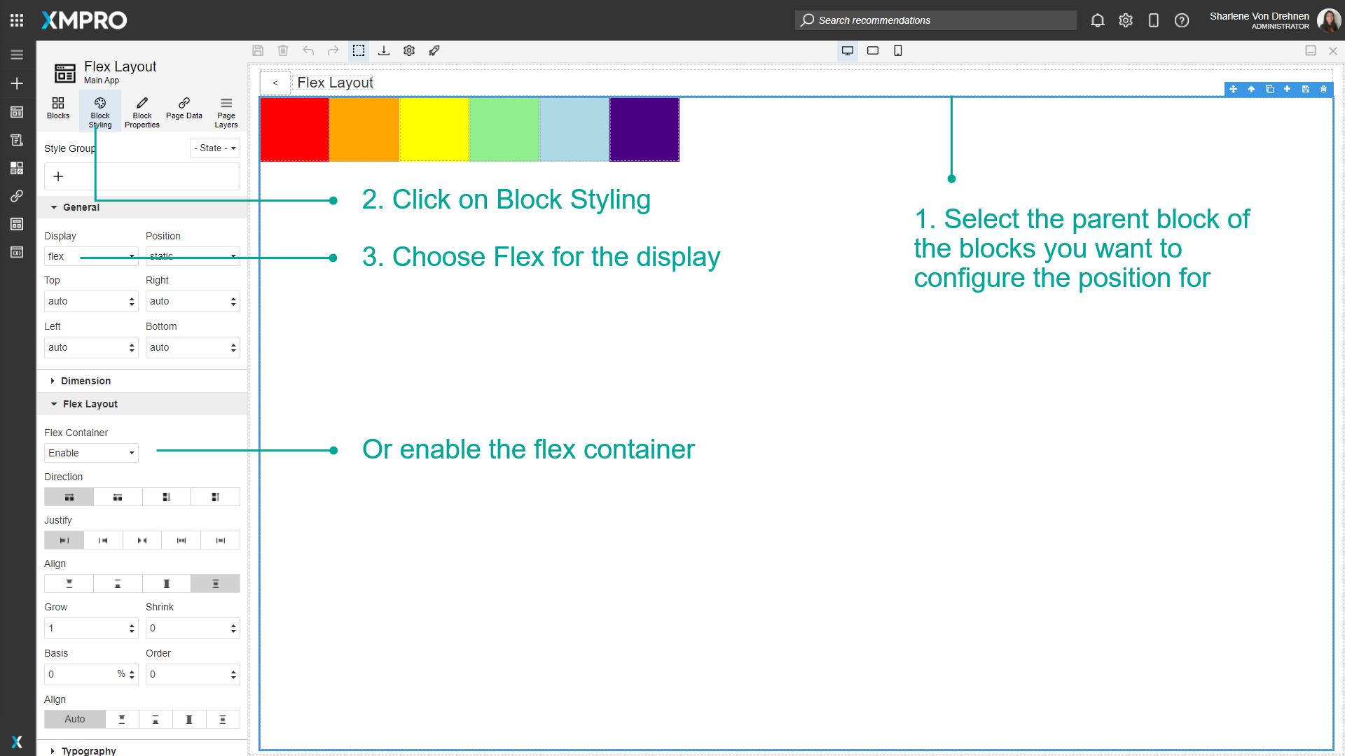
Enabling Flex Styles
To enable Flex styles, follow the steps below:
- Select the parent Block of the Blocks you want to configure the position for.
- Click on Block Styling.
- Choose Flex for the display or enable the flex container.
Flex Container
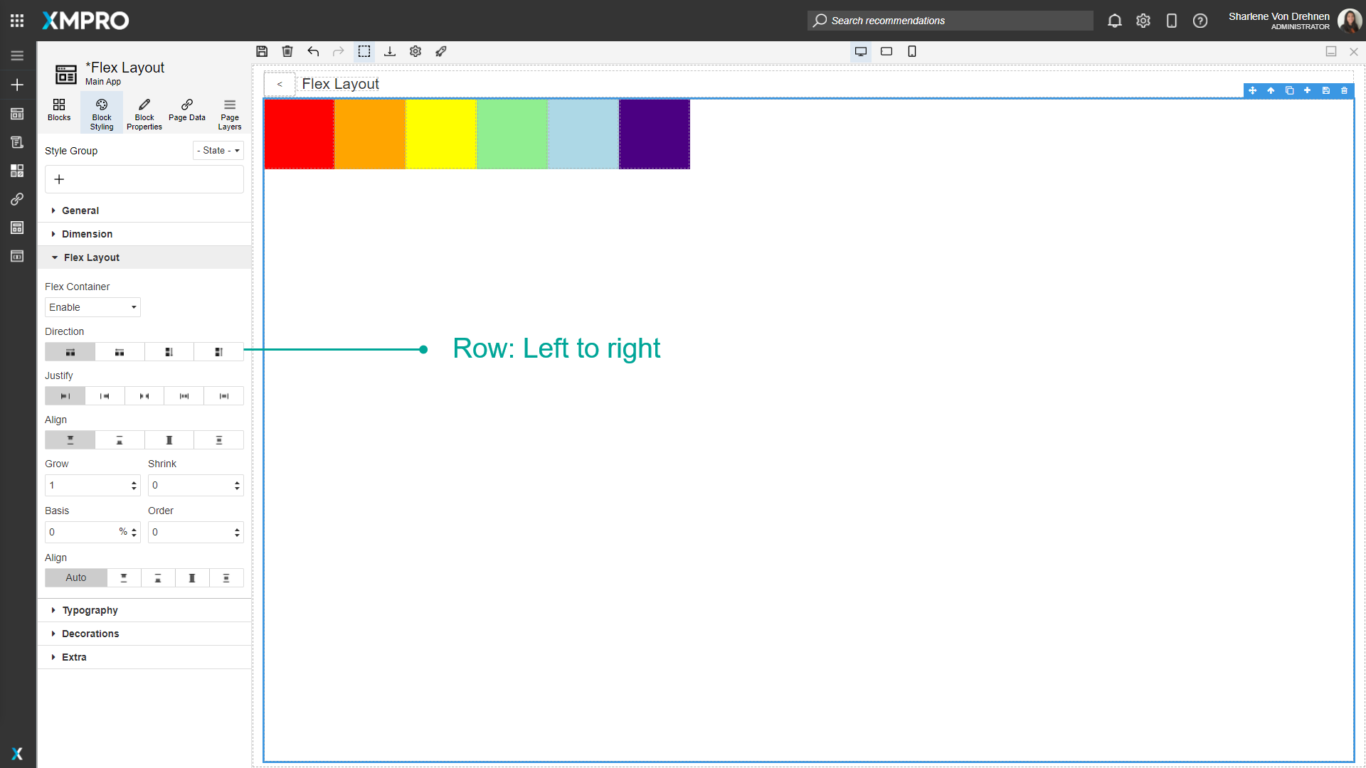
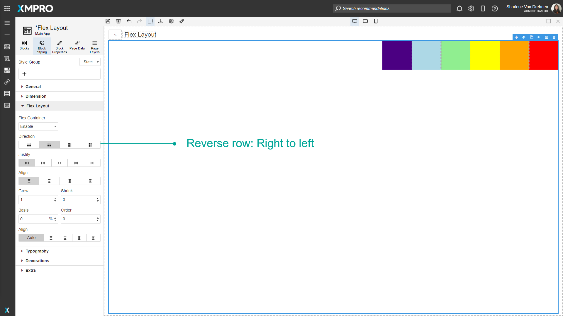
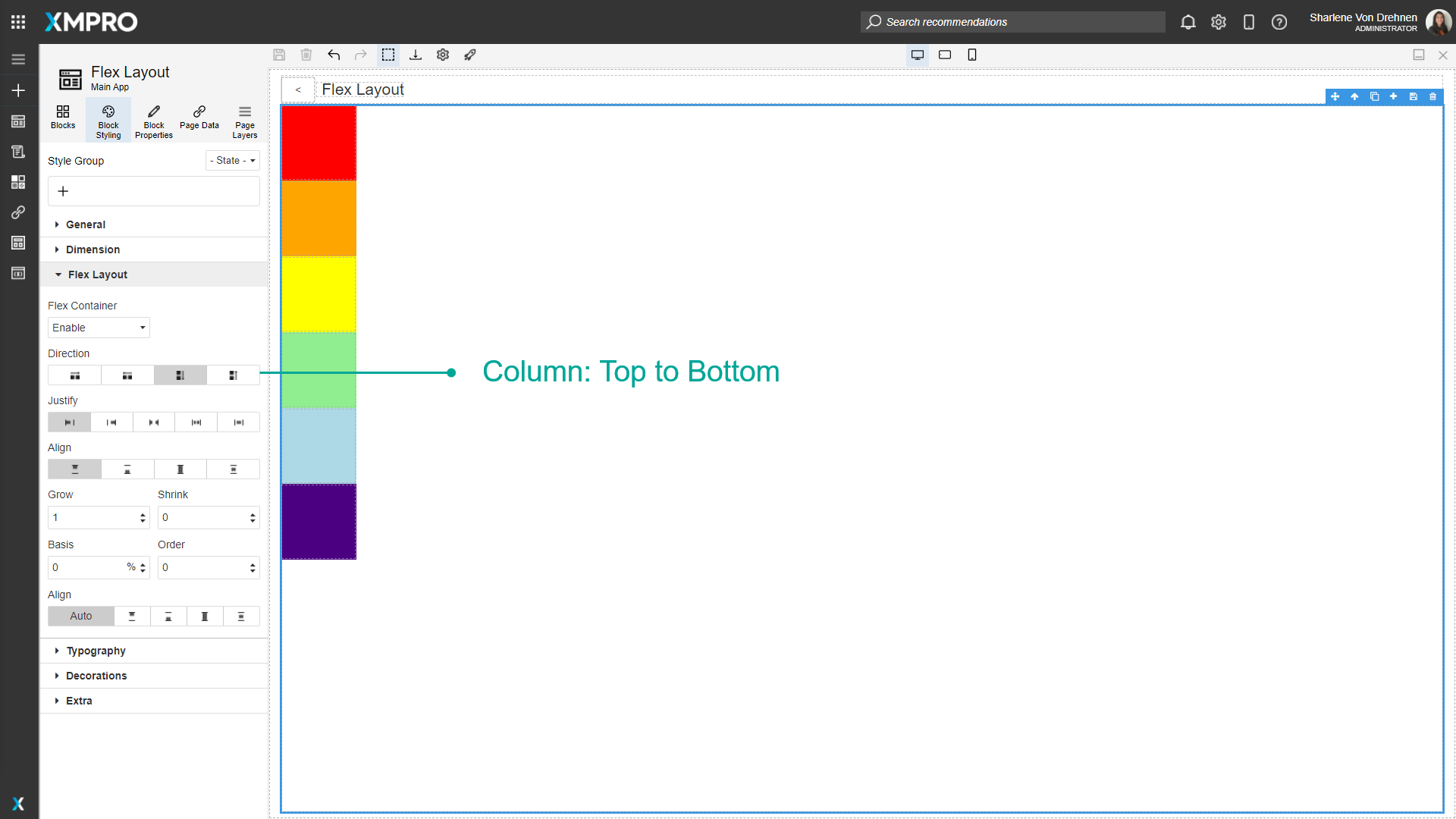
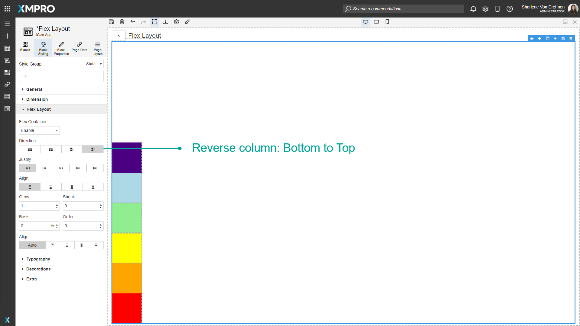
Direction
The direction determines which direction the content will go. It can either be:
- Row - Left to right
- Reverse row - right to left
- Column – Top to Bottom
- Reverse column – Bottom to Top
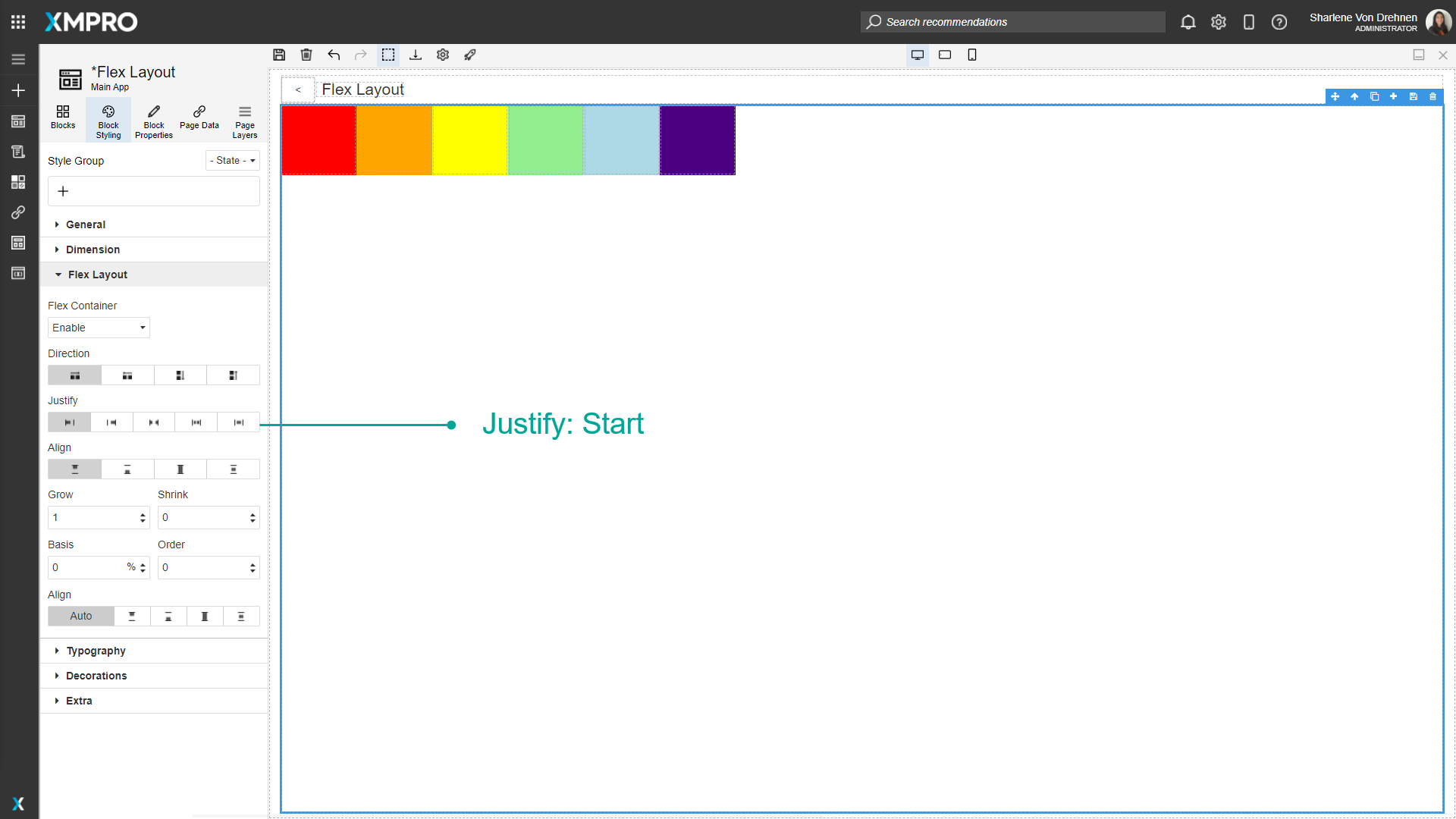
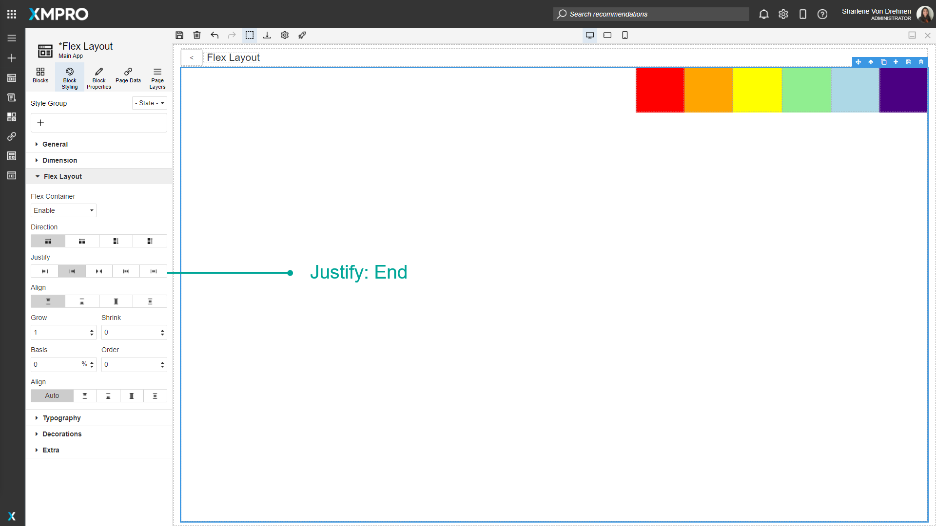
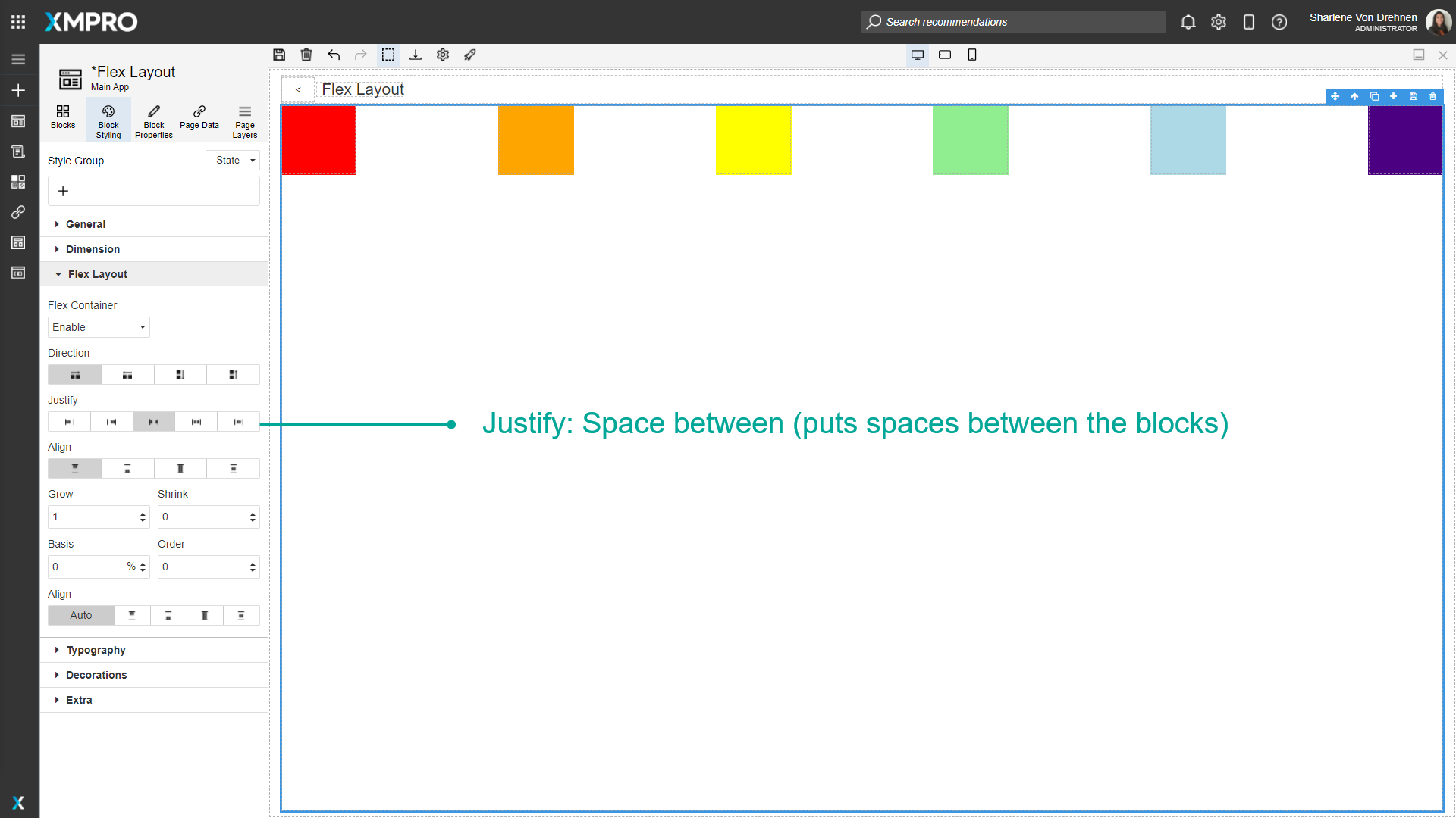
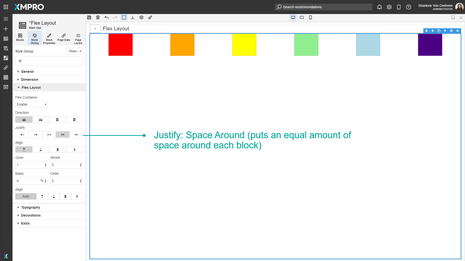
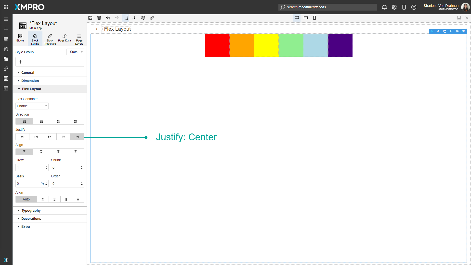
Justify
Justify determines the way the contents are laid out. It can either be:
- Start
- End
- Space Between (puts spaces between the Blocks)
- Space Around (puts an equal amount of space around each Block)
- Center
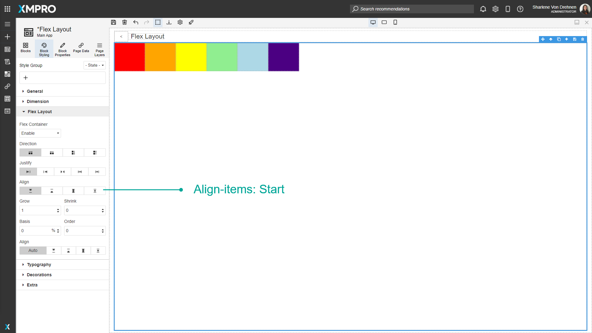
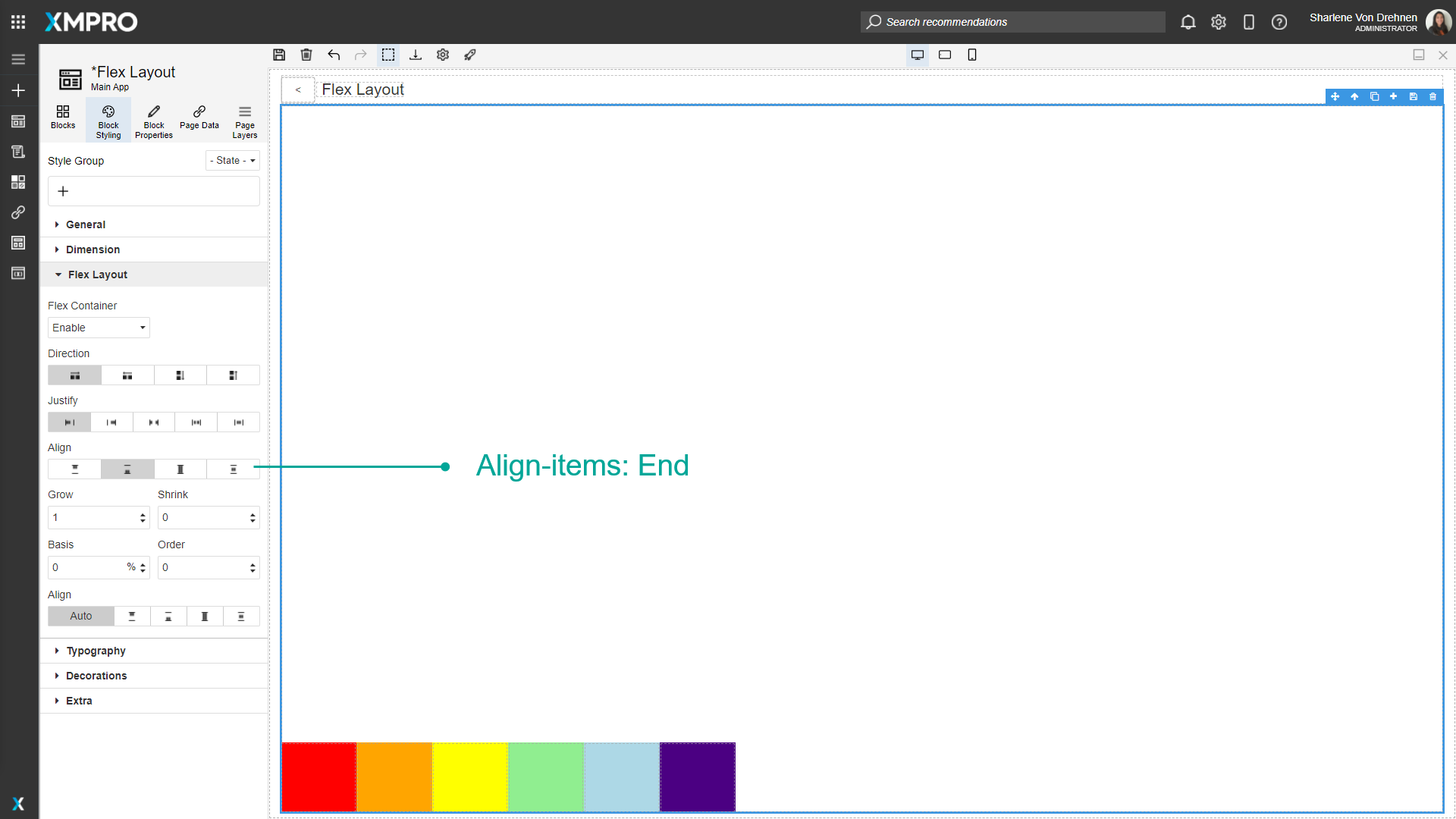
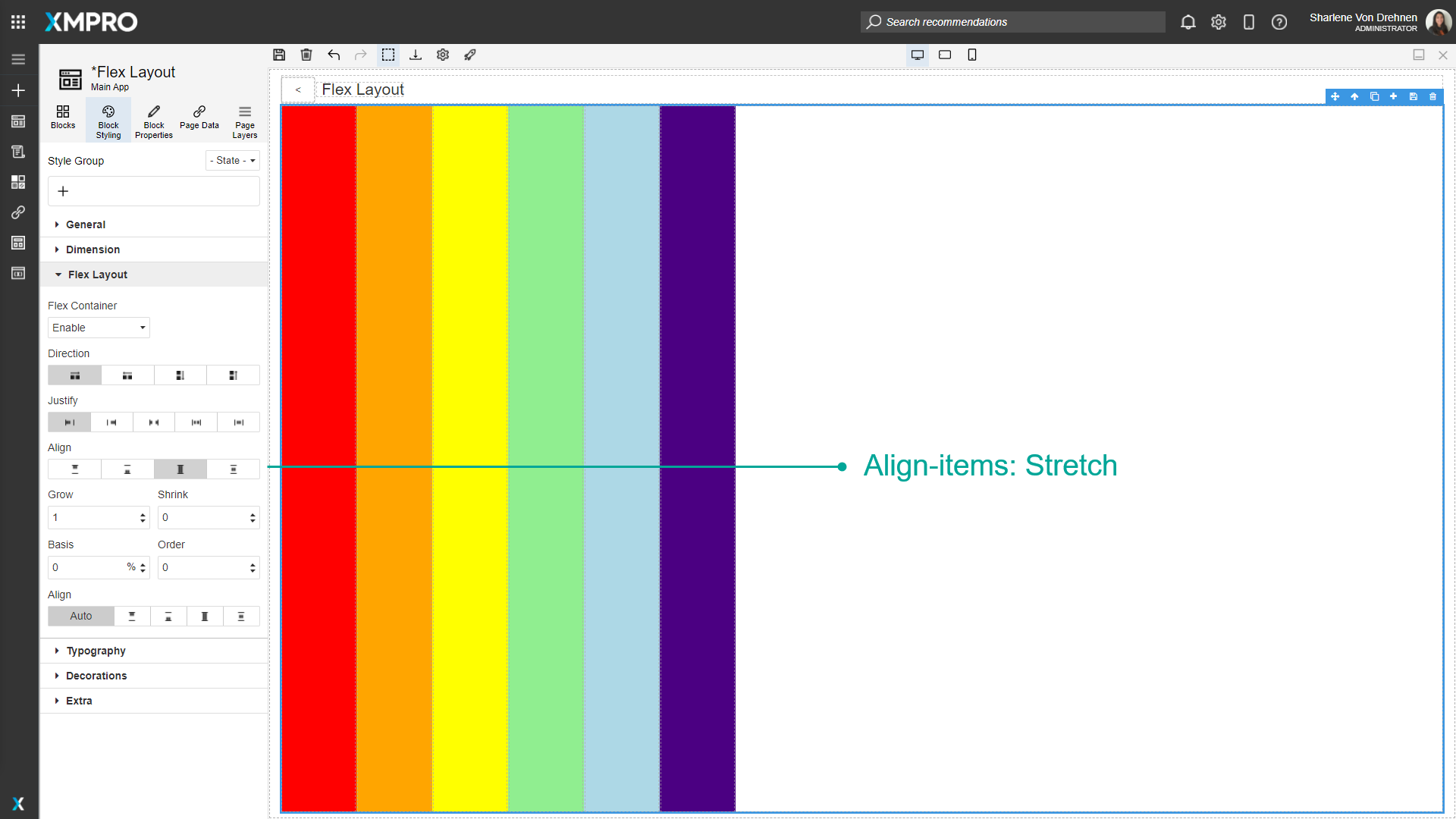
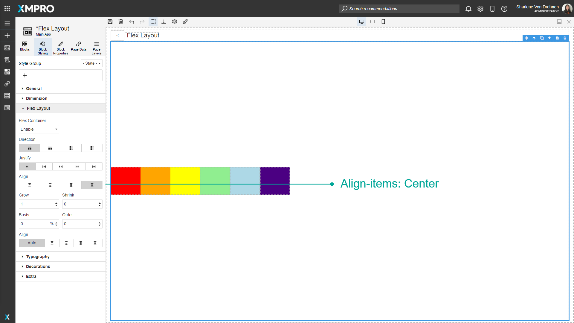
Align-Items
Determines the vertical alignment of the Blocks. It can either be:
- Start
- End
- Stretch
- Center
Blocks inside the Flex Container
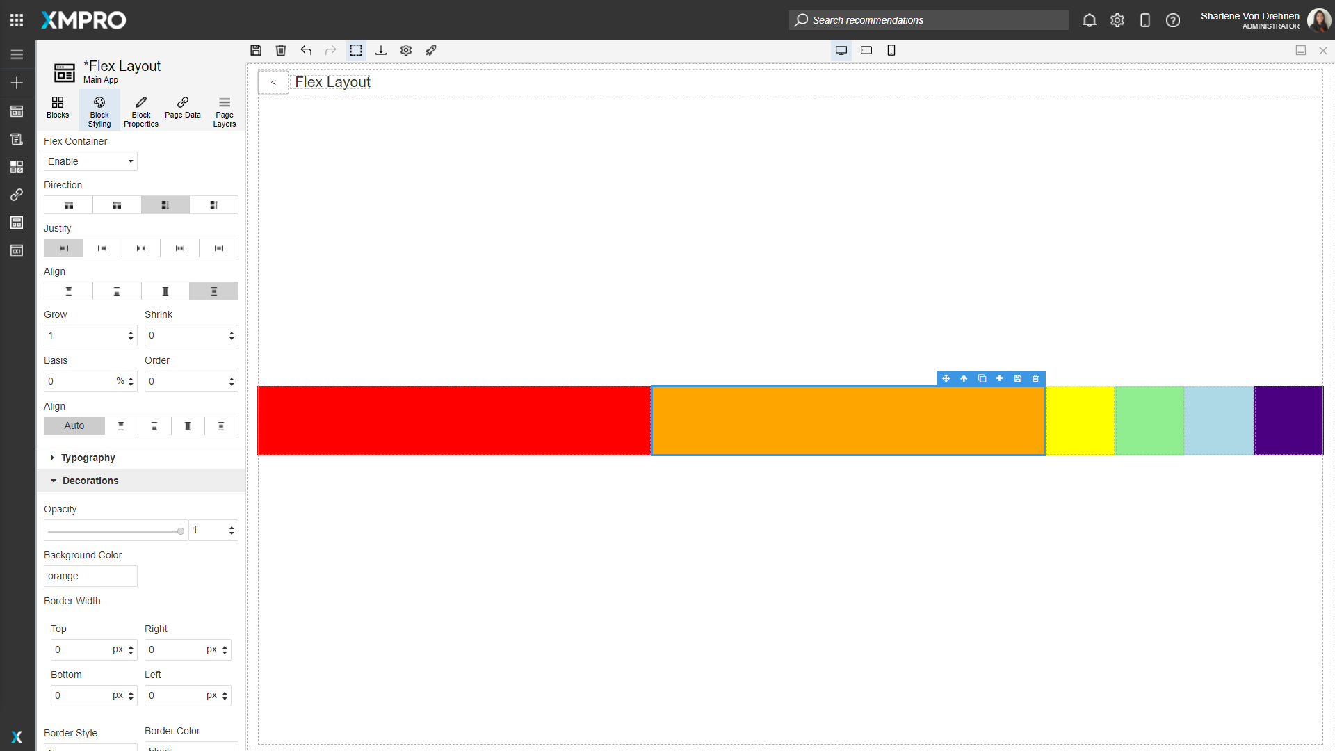
Grow
Grow will grow the item to fit the container.
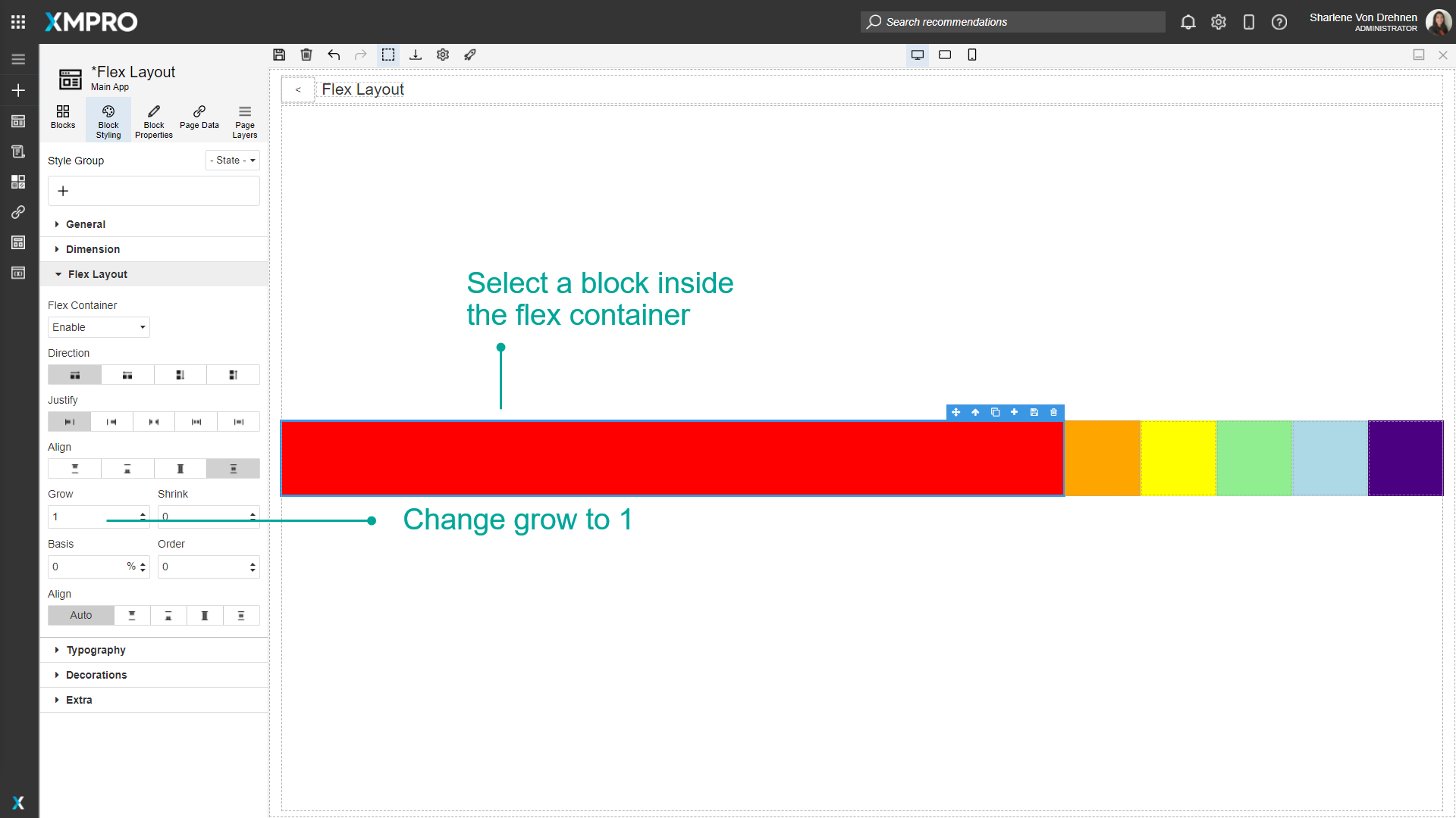
If multiple Blocks have a grow value greater than 0, they will take up a ratio of the available space.
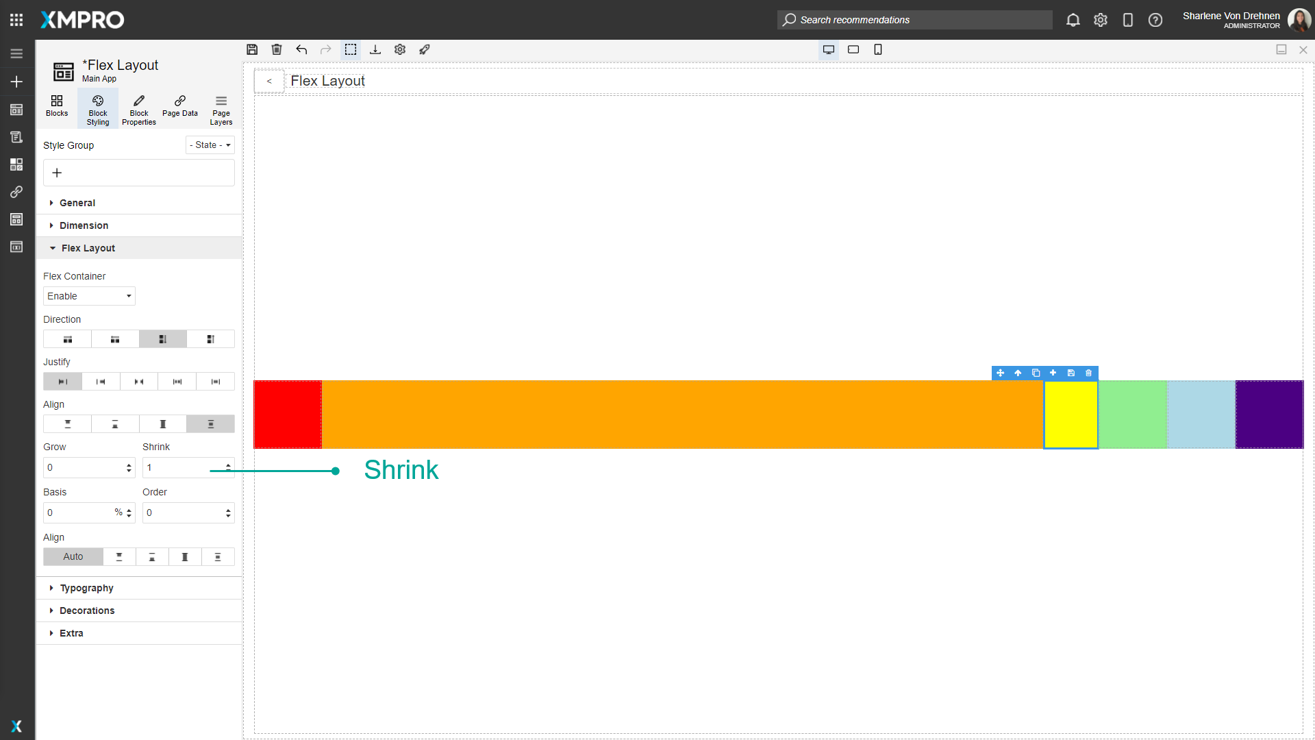
Shrink
Shrink determines whether an item is allowed to shrink if the screen is too small or if other Blocks take up too much space. Shrink will not work if the Block has a minimum width or height.
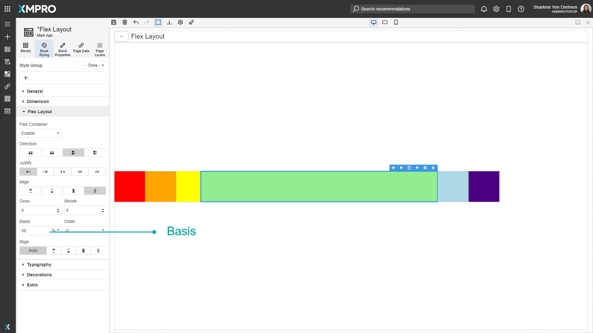
Basis
This determines the default size of the object along its direction axis.
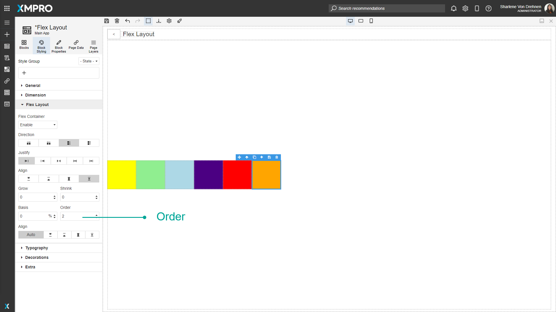
Order
The order will change the order of the Blocks. Blocks with no order will be displayed first, followed by the ordered Blocks going in ascending order.
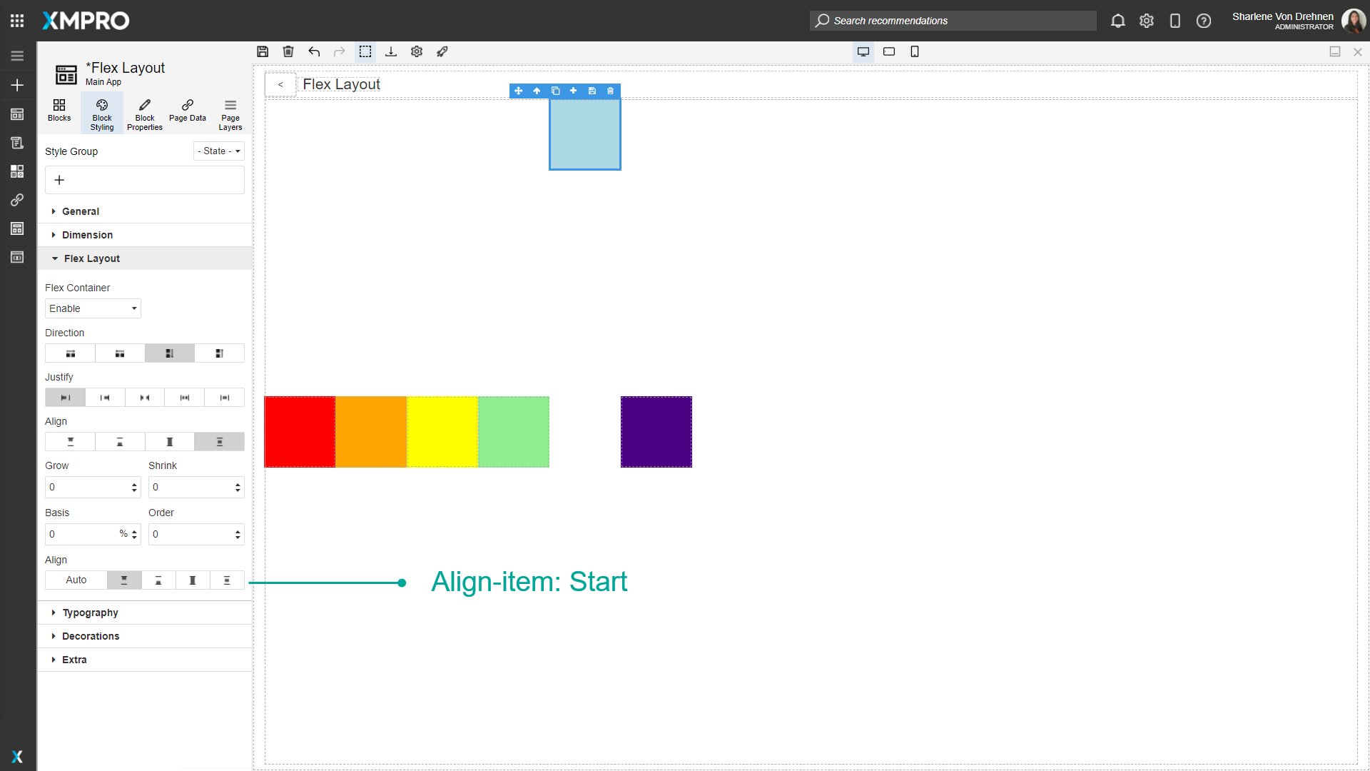
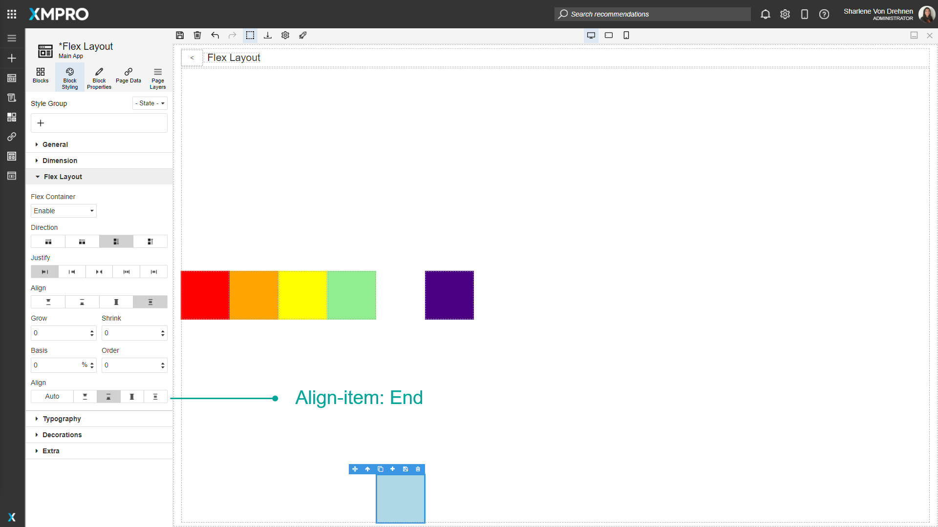
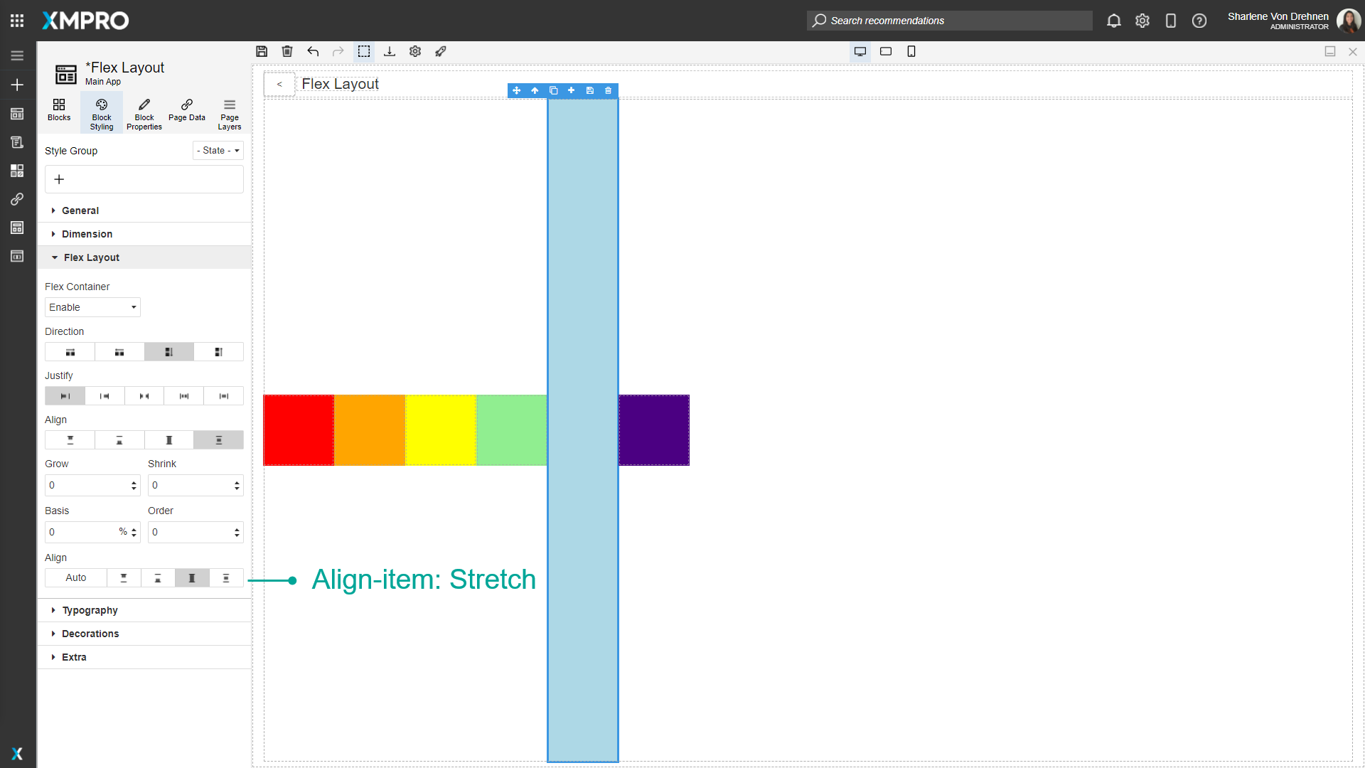
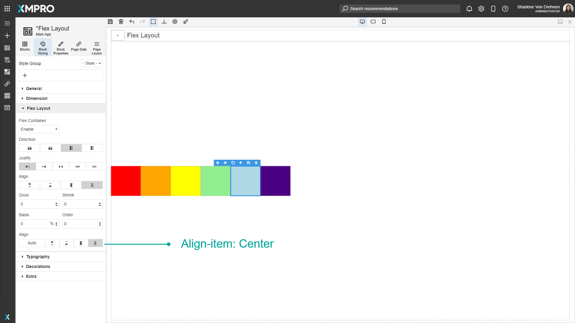
Align-Item
Aligns the individual Blocks. They can either be:
- Start
- End
- Stretch
- Center
Further Reading
Last modified: May 01, 2026